

BRIEF:
Steampunk Coffee are a specialty coffee roasters based in Kirk Ports, Berwick. The business required a a new logo and packaging design.
SOLUTION:
I designed a new, beautifully crafted wordmark and accompanying responsive logo suite including a stacked version of the logo, a monogram version and secondary badges. The responsive marks allow the brand identity to be applied across touchpoints regardless of size or shape.
For the packaging I retained the original boxes, with a fresh new roast flavour, type lockup which sits comfortably below the logotype. A vibrant pop of colour was added in the form of a monogrammed sticker which seals each box. Finally, simple brewing guide was applied to the side of the box.
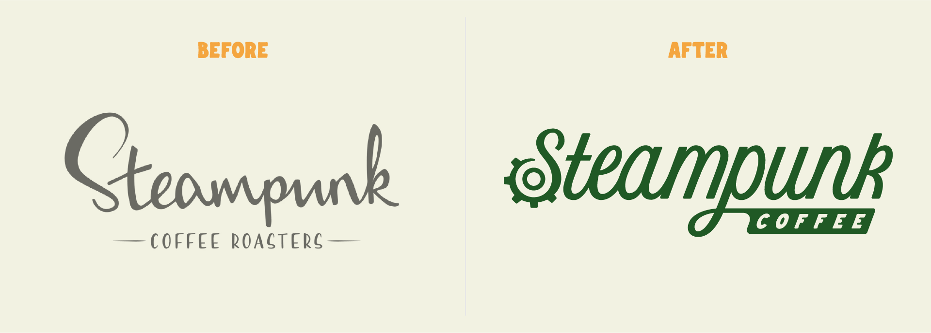
The Logo System
Steampunk have their finger in a lot of pies, so for this logo project I knew that a comprehensive system of wordmarks, icons, and secondary logo marks would be essential. The idea was to brand everything with the logos in order to build audience recognition. It was important for the branded materials to be social media friendly, encouraging organic marketing through shares and likes.

Concept Sketching
As with all logo creations, the research and discovery stage was shortly followed by lots of concept sketches. Each concept was carefully considered to be able to easily transition in to a stacked version or monogram. While many of these sketches made it to final stages of the process, in the end one concept was chosen that ticked all the necessary boxes.


BEHIND THE BEANS
Following the success of the Steampunk logo re-design, I re-designed the the logo of the Steampunk Coffee Podcast, named “Behind the Beans”. The podcast logo was designed to be consistent with the Steampunk logo, utilising many of the same elements whilst having it’s own quirks and character.