BRIEF:
The North Taste food blog is the passion project of Hannah and Greg . Founder Hannah, came to me looking for a new logotype which more accurately reflected the professionalism of the blog, whilst retaining a playful design sensibility. What began as a passion project, sharing dining experiences at local eateries and helping people find the best breakfast bao in town; now had the potential to be a stream of income through paid partnerships, advertising, and mech.
SOLUTION:
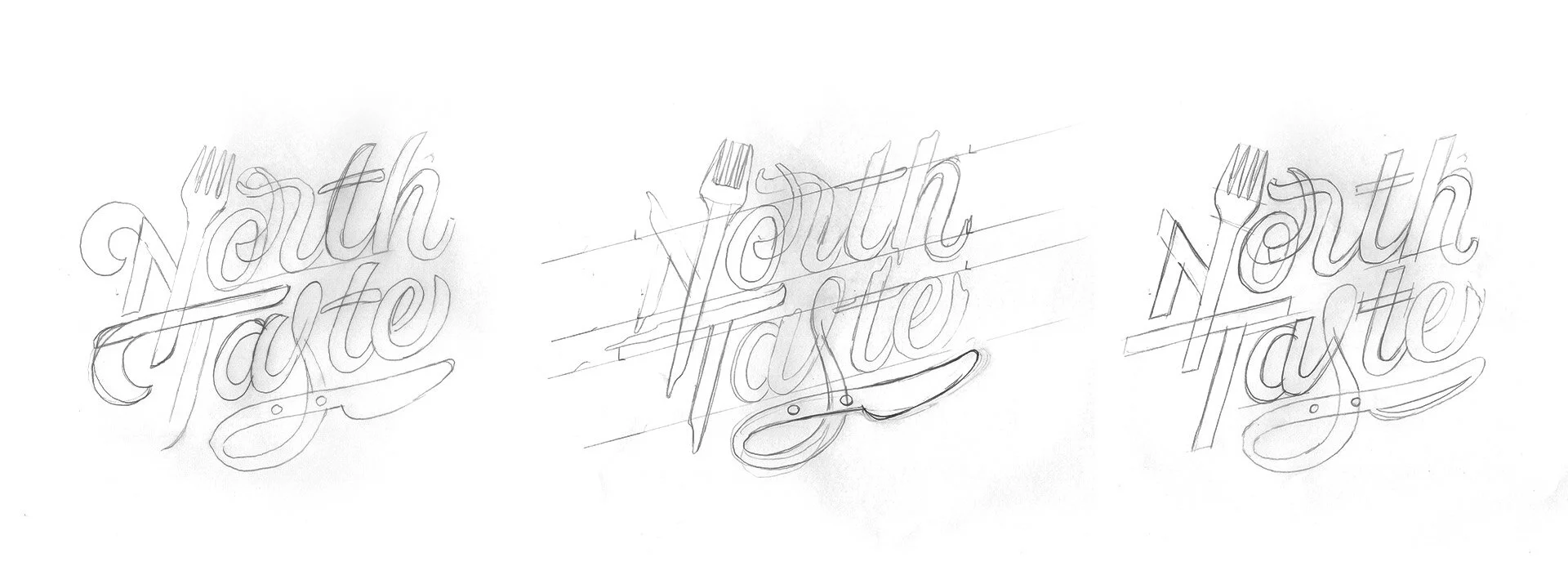
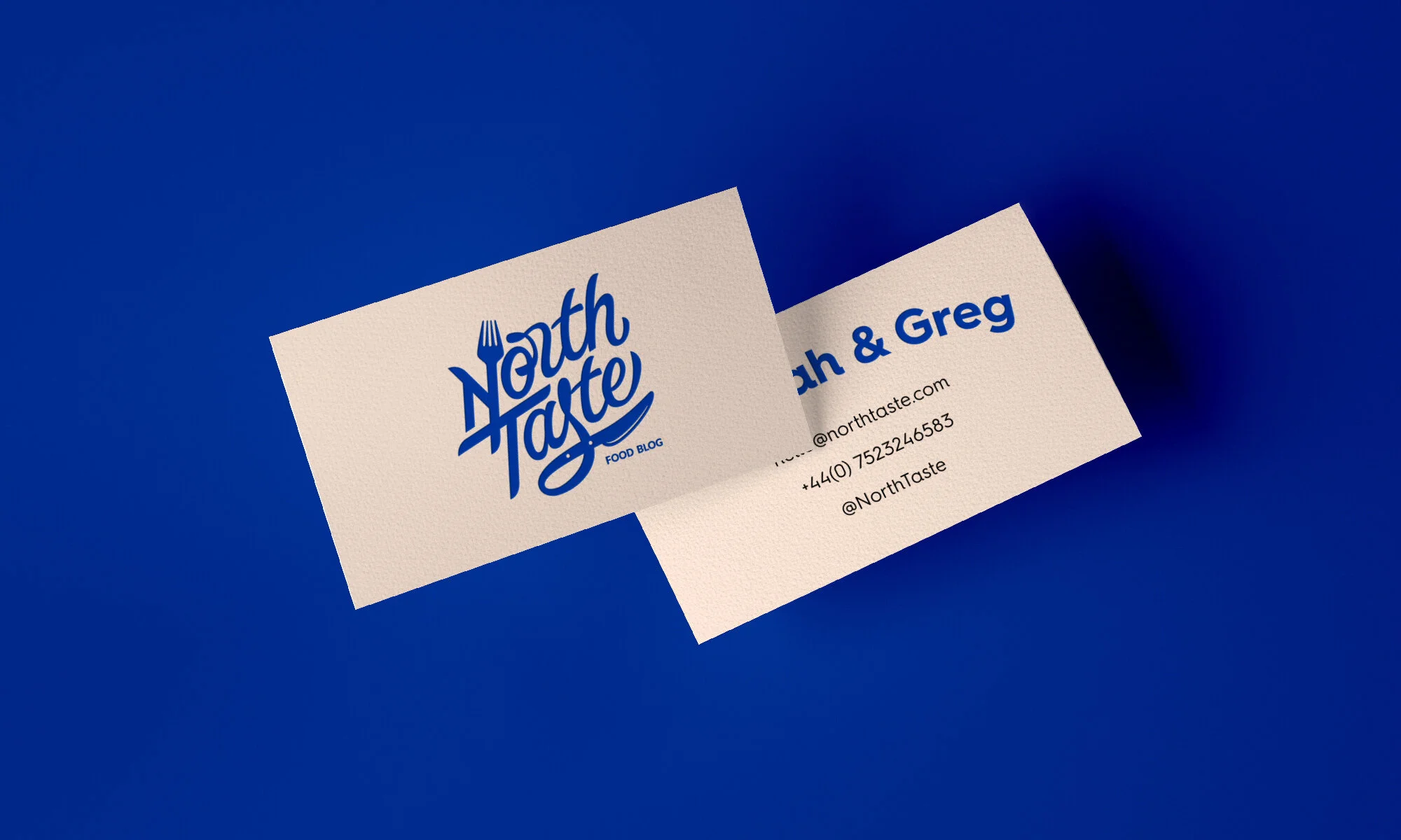
The goal was to make a more visual presence that danced on the line between fun hobby and professional business. We decided to start simple with a refreshed logo and colour palette. I designed a script wordmark which integrates eating utensils as part of the letterforms. The logo is pretty with an edge, and I’m not talking about the knife! The letters are intriguing and invite people in to find out more about the blog. The large spacing allows the logo to scale down to an Instagram profile pic and be just as effective as it is on a tea towel or tote bag.
Through refinement and careful consideration, the logo was given a playful style with a cool edge. The brand is easy going and happy, so I wanted the logo to reflect this without looking too soft.
Projecting a more professional brand image would help to convey an authoritative voice, attract paid endorsements, and it looks pretty on a tote bag or T-shirt!


